After looking at the design of my front cover I have come to the conclusion that I will definitely need to take the pictures again because the quality of them is too poor. I will take a number of different images again and this way I will be able to use PhotoShop properly on them to get a better result. Because of the poor quality of the last images I wasn't able to to work on the quality of the skin or work on the eyes etc because it became to blurry. Hopefully when I've taken new images I will be able to make these changes and give the image a more professional finish.
Wednesday, 21 December 2011
Tuesday, 20 December 2011
First draft of magazine front cover

This is the first draft of my music magazine. I am pleased with some of the techniques I have used but I know I can improve it a lot. The first thing that is very obviously wrong is the quality of the image. I need to go out and take the images again so I can use a better quality image to get a higher grade. I'm also not sure about the colours and where the date and price are but these are all things I can improve upon.
Monday, 19 December 2011
Practice photoshop image

The original image

The image after PhotoShop
On photo shop we learnt how to get rid of imperfections in the skin and how to make their skin look very clear and like porcelain. We also looked at colour within the image and how to makes lips and eyes brighter for example. We were also taught how to pull areas of their body in to make them look slimmer than they are and how to make certain features look bigger than they are. In this attempt I made her eyes look bigger and rounder than they are in the original image. I will now be able to use some of these techniques in the pictures i take for my music magazine.
My initial photographs

This is one of my favourite pictures I took because I like the pose and I like the choice of clothing my model is wearing. I think the mean and moody pose works best because I took this image as a smiling picture too and it didn't look as effective.

This is the image I want to use as my front cover image because I really like the original Pixie Lott image that I modelled this photograph on and it's a different pose that wouldn't always be associated with the front cover of a music magazine. With this image I can still use a lot of the conventions of a magazine front cover such as a left third, skyline and even a banner going across the page.

I like the pose in this image because she's holding both hands in a different position to each other. This is also similar to some of the images I've looked at to give me ideas on how to make my model pose.
This idea was taken from Pixie Lott's extended album cover but I'm not keen on my final design on this image and I don't think it would be a great front cover image.

I like this image but for me I didn't get the facial pose how I wanted it to be.

This image wasn't one of my original ideas but at one point I asked my model if she had any extra ideas and this is one of the images we took. I like the outfit and accessories she has on in this image and I also like the stance but I think the facial expressions is too smiley, I like the serious look.

This is a similar pose to my first image but in different clothing, I really like this pose and the change in clothing is a different variation I have to choose from.

This is the second main change in outfit i made. Even though this image is taken on the side she's still making eyes contact with the camera but I'm not sure I like the decision on this outfit as much as the other one.

This is another variation of the original Pixie Lott picture I liked. This is more like the original image because she's wearing the flowing dress but again I prefer the other outfit choice.
Monday, 12 December 2011
Character profile of my model - Music Magazine
Evie Rouse
Born January 1995 (aged 16)

Evie is one of my friends that I have known throughout high school and we have remained friends when we have moved on to Wyke. Evie studies English Language, Psychology, Geography and Graphics and would like to go on to university to study English or Graphics.
I chose Evie to be my model for my main music magazine project because I know she is reliable and consistent and as she does other coursework subjects such as graphics and English, she knows how important this is to me.
In her spare time, Evie likes to keep fit and she goes to the gym and other night classes on a regular basis. She also likes to listen to music, go out with her friends and she works in an Indian restaurant to get some spare pocket money. She is a very motivated person who likes to have fun at the same time.
Friday, 9 December 2011
Images that have influenced me!

I like this image because of how simple it is. The only things that make this image stand out are the clothes Jessie J is wearing and her makeup and this would be quite easy to recreate.

This image is also very simple but very effective. I like the pose Pixie Lott is stood in for this image and I know that these clothes will be a lot easier to get a hold of.

I think this image is really lovely but very different, it's a different way of getting the whole body into the image without them being stood up. If I take an image like this for my front cover I will take it so the model is facing the other way so they're on the right hand side of the page and then I would be able to use the usual convention of a left third more easily.

This image is very cool and different. I would take a picture like this if I want my artist to dress differently and be very individual although this doesn't really give off the impression of a typical pop star.

This is a really good close up of Nicki Minaj and it would be very easy for me to stage an image like this one. If I don't take a picture like this I would maybe use some of the concepts of it.

This is my favourite picture out of them all because I think what Pixie is dressed in is very nice and I love the pose she's in. This allows us to see a raunchy side to Pixie which could be a bit too much for younger children to see but I think for my target audience this would be acceptable and would possibly make people aspire to be like her.

I like this image as much as the other image of Pixie Lott bobbing down but I think this one could look better because of the extra use of colour. I'm not as sure on this pose but I could combine the two to create my own image.

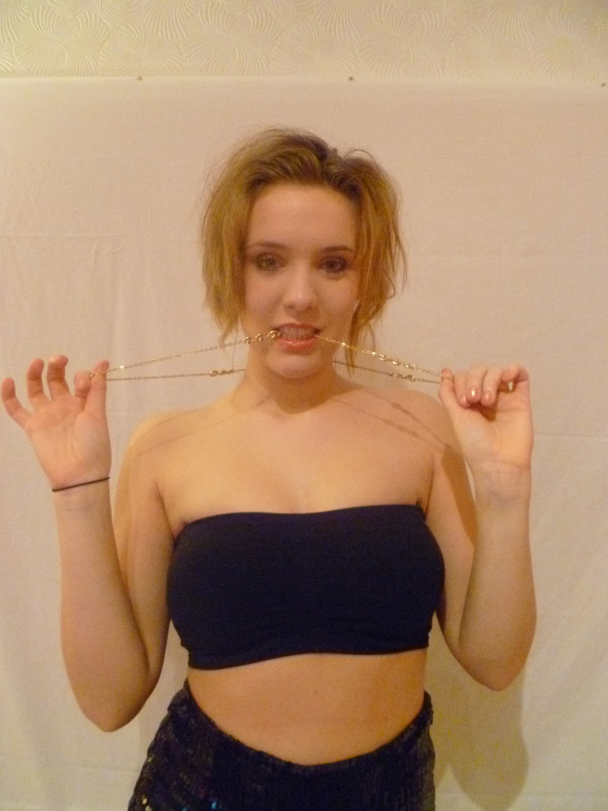
This is the image from Pixie Lott's album cover but I think this could also work on the front of a magazine. I think the chains around her neck could be too much for a magazine front cover as they're usually quite simple but I think the chain that she's holding around her head is quite a nice twist on the image.

I think this image is very nice. It shows off her shape which will attract the boys but it's also an image girls can aspire to and is a very proud image.
Thursday, 8 December 2011
Magazine title ideas
Official Chart (mag) – this came for the idea I was going to make the official magazine for the official charts company. I’ll make the masthead in the same font as the official charts company logo and I will also use the same colours and style. This could be quite difficult to do but I think it is quite a good concept.
Poparazzi – a play on words from the word paparazzi. I came up with this idea while I was at an Example gig in Newcastle as I was taking a picture of him. I like this name because my magazine is all about fresh things and meeting new artists and seeing lots of new, exciting pictures is part of this process. It also ties into the music link because stars are followed around by the paparazzi.
Pop Stars and POP! – this is what is going to be in the magazine and therefore I thought it would be an apt name. Names like this have been used before though and recently a new child-teenage magazine has come out that is called I LOVE POP so I don't think these name ideas are very original.
Poptastic – this was a term the late Alan Freeman (Radio 1 DJ) used during his time on Radio 1 and before that at Radio Luxembourg. Tony Blackburn has also used this in the past so I thought it would be good to use because of its history. It is also quite a catchy name.
Wednesday, 7 December 2011
Institution
The publisher of my magazine is going to be Bauer Media who are also the publishers of Heat magazine, Bella, Take a Break and two leading music magazines Q and Kerrang. The company also run radio stations and box television. The reason I have chosen Bauer Media to produce my magazine is because although they already publish two music magazines, they’re very different to my pop magazine. Q magazine is a magazine very much full of alternative music with a bit of chart, indie and rap music, Kerrang magazine is a rock/metal magazine. Some of the TV stations Bauer Media is involved with are those which show pop and chart music videos, therefore I think it would be an investment they’d be interested in and it’s also something they don’t own yet.
Ideology
The aim of my magazine is to encourage young people to be themselves and enjoy their own style and who they are. The artists used in the magazine will all be good role models or people with stories of how they’ve turned their lives around.
Target audience
The target audience for my magazine is going to be males and females but a majority of females with a ratio of 80% females and 20% males. The mean age of my audience will be 17/18 year olds who are in the social classes of C2, D and E. This will mean my magazine will be affordable and produced at a speed they’ll be able to get money together for. I want the audience for my magazine to be young independent people who aren’t afraid to be themselves and still enjoy typical pop/chart music.
Thursday, 1 December 2011
Thursday, 24 November 2011
VIBE LIIAR analysis

Language – this is a very simple looking front cover for the music magazine. It has a very basic colour scheme of pink, white black and blue which work very well for this cover. As the main background is blue a white masthead is used so it stands out. The font is a san serif font as it is a main convention. White is also used as the predominant text colour for the other headlines on the blue background but pink and black are used on the white background so we can see the headlines. The main image (Nicki Minaj) is dressed in three of the four colours so she’s relevant to the rest of the cover. This front cover does not typically follow all of the usual conventions of a magazine front cover as the text isn’t all in the left third and there aren’t any flashes, smaller images, etc.
Ideology – the ideology of this magazine is for new and alternative music to be portrayed to the public along with American Billboard chart music. They want the music scene to be "fresh".
Institution – Vibe was launched in 1993 by Quincy Jones in NYC and was partnered with Time Warner Inc. In 1996 Miller bought Vibe and they owned the magazine until The Wicks Group of Companies bought it in 2006. On 30th June 2009 Vibe shut down although a private equity fund called InterMedia Partners bought the magazine and are now working on a new brand.
Audience – the audience for this magazine are young people from teenagers up until their early thirties. The audience is predominantly females although males are targeted at too.
Representation – this front cover represents women in a strong and powerful way. Nicki Minaj (the woman on the front cover) is seen as somebody who stands up for what she believes in and is a headstrong woman. Her pose emphasises this view as she’s stood with her hands on her hips which could be seen as a arrogance and her legs been apart also adds to the attitude along with her tongue sticking out. The images at the bottom of the magazine cover though could create an innocent feeling about the cover as it is an array of small animations.
Kerrang LIIAR analysis

Language – this magazine only sticks to a few of the usual magazine conventions. The masthead is done in a san serif font which makes it bold an stand out and the white text on the black background adds to this. This is also a display font meaning it wouldn’t be used again in the rest of the magazine. The connotations of this type face is that of a smashed mirror. This could be linked with the genre of music and the fact it can be turned up that loud it would smash mirrors. The main image on this front cover is almost centralised and this has allowed them to put text and images on either side of the main image. The main headline which is linked to the main image is in a banner which goes right across the page. This as a background is also dark with red text on it which follows the theme of the rest of the magazine front cover. A lot of smaller images are used to advertise what else is in the magazine. A splash is also used as a screamer to advertise a prize that can be won.
Ideology – Kerrang is all about rock and metal music from all over the world. It is a way of interaction for all rock and metal lovers shows an understanding that it is not wrong to like that type of music.
Institution – Kerrang was first published on the 6th June 1981. To begin with it was a one time supplement in the Sounds newspaper which had a focus of the new wave of heavy metal in Britain and other rock bands. Angus Young from the band ACDC was on the first ever cover. Originally Kerrang was owned by United Newspapers but they then sold it on to EMAP in 1991. In 2008 Kerrang was then sold on to Bauer who are the current owners of the magazine.
Audience – the mean age of the Kerrang reader is 22 and it has an ABC1 profile meaning a lot of its readers are in the upper class or people with good jobs. It has a circulation of 44013 and a readership of 396000. 87% of it’s readers buy every issue which is produced on a weekly basis.
Representation – in the main image Jared Leto is starring straight into the camera clenching one fist against a flat palm. This beard/stubble gives him a rough edge and the clothing he is wearing does too. These connotations go with his reputation and the type of musician he is. His eyes are very blue which creates a slight innocence to the way he is. Also on the cover there are other pictures of stars just looking like they’re enjoying themselves.
NME LIIAR analysis

Language – this edition of NME is a special Christmas edition which influences a lot of the conventions on this magazine front cover. To begin with the colour scheme on this cover is grey and black with white snow and Christmas red. This sticks to the Christmas theme and also makes the components stand out. The masthead is in red because this makes it stand out and it’s also in san serif font along with the other main headlines. It also has snow on the top of the writing and the splashes on this front cover are all in the shape of Christmas tree baubles. All of the text is in the left third so the main image dominates the right third along with the bar code. Above the masthead is a skyline which is also related to Christmas and an advertisement. The subtitle is in serif font and smaller than the main headline because it isn’t as important.
Ideology – the idea of NME is to encourage different music and allow people not to follow the crowd and be proud of their individual music tastes. It’s all about new music and new ideas. This edition is a special Christmas edition which incorporates Christmas ideas.
Institution – NME is published by IPC Media. Originally NME was published as a non-glossy tabloid publication but it then became a music magazine in the 1980s. In 1996 NME started being published on the internet which now has 5 million users every month.
Audience – the target audience for the NME is men between the ages of 17 and 30. This doesn’t just mean it sells to those people though as 73% men buy this magazine and 27% women buy it. The average age of the consumer is 25 years old.
Representation – in the main image Simon Cowell is looking straight into the camera which creates an automatic bond with the audience. His eyes look slightly evil and scheming and the whites of his eyes are very bold and bright apposed to the pupil. His mouth is on a slight angle and he is almost smirking at the camera. He doesn’t look particularly grim like the Grinch is but he does have an edge to him were it’s almost difficult to understand what is going through his head.
Wednesday, 9 November 2011
Music magazine preliminary brief
To produce the front page, contents and double page spread of a new music magazine. All images and text used must be original, produced by you. Minimum of four images
Evaluation
My magazine cover uses quite a few conventions of a real media product in the form of a bright bold masthead and the sell line underneath this. Yellow is a popular colour in media to create titles and it also works well with most other colours. I’ve also used the left third very well by putting all of the headlines there and the main headline is bigger than the others which attract attention to it above the rest of the stories. The bar code is in the bottom right of the image which is also another regular place to put it along with the price, date and issue number above it. I’ve also used a splash which is a small animation which is generally also put in the right third. The image is a large image which fills the whole page. She is looking straight into the camera which creates a connection with the audience straight away and also allows us to see the emotion in her eyes. I got the title of my magazine from the prezi which I created and I chose the one which I thought was the best. It’s a slight play on words in relation to the cover line as this is have your say.
The ideology behind my magazine front cover is to encourage people to be who they are at college, work hard but try to enjoy their time while they’re there. The advice pages in the magazine are there to help people with their problems but also to encourage people to help others with the hard things they are having to deal with. It will also hopefully make people realise how lucky they are to have a great education and encourage them to use their knowledge wisely. Some stories will also be focused on subjects outside of the college which will also allow other opportunities.
My front cover represents college students in a very good light because the student I’ve used is very happy which is what you would want from a college student. Her smile lights up her whole face and she has a happy sparkle in her eye too which adds to the effect. Her cheeks have a healthy glow in them which also portrays the college very well and makes it seem like been at college has made her this way. She’s wearing nice clothes and doesn’t have a hood on her head which breaks the stereotype of teenagers been trouble makers and rude.
I think this can relate to both males and females although this cover could possibly relate more to females. If a male was used I think it would make the boys more likely to buy it. I also think this could be a good place for teachers to give out information and help students anomalously if they need to but from this design I’m not sure they would do that. The sports pages in this magazine will attract a different audience to science pages or language pages. These different features will attract a more varied audience. To attract a good audience and allow for production costs I’ve made the magazine £1.00. This will be affordable for the students but there can also be a lot of advertisements in the magazine which will pay for extra production costs.
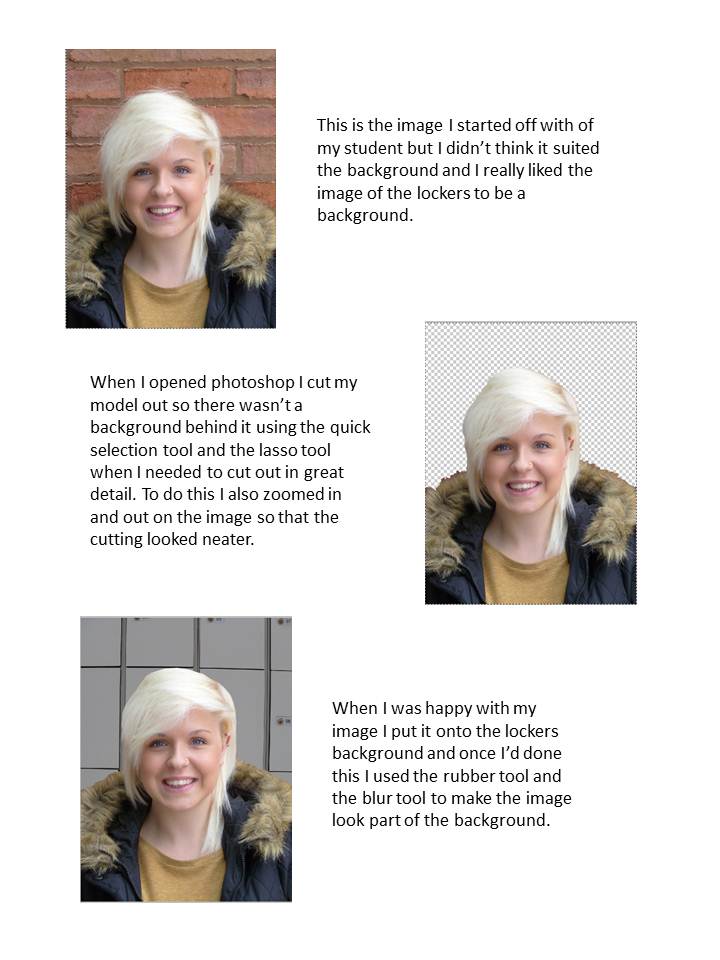
To create this image I had to learn how to use photo shop properly which made the experience longer and more difficult but by the end of the task I was using it very well and I was able to manipulate pictures quite professionally. Firstly I took my images and imported them onto the computer. I then cut out the image of my model and put it onto the new background I had. I blended the images together so they looked realistic and then added the other components to the image.
The feedback I’ve had on my cover is mainly positive about the colours used and the image I’ve taken. The size of the image has been positively commented on and so has the use of the yellow for the text. It’s also been said the smile on my models face is a nice representation of a college student. The only issue with this is the back drop. I was told it could’ve been thought about slightly better but this is a lesson I can learn from.
My final design

Because this is my first attempt at using photo shop I am pleased with my end product and I hope I can improve on this for my music magazine but it was a great experience.
Draft contents page

This is my first idea of how I would like my contents page to look. I'm not sure it suites the college magazine but I think it could work for a music magazine.

Tuesday, 1 November 2011
Magazine front cover images

This is the first image I took of India with her coat on and indoors against a blank wall. I took a few variations of this picture, some horizontal and some vertical, some with the coat and some without. I took it against a blank wall so it would be easier to cut out on PhotoShop if I needed to.

I then took pictures against a wooden door which gave me a different background option and I also took these images in the same way as the first ones, with and without the coat, and horizontal and vertical.

I then took some pictures against the lockers to see what this background would look like in my pictures.

I really like the pictures of the bricks in the background but I wasn't sure it would work very well with the rest of my magazine cover. I don't think the colour scheme would've worked too well and I think it would've made the picture too 'busy'.

I really like this image. I think it looks really good but I didn't think it was front cover material because of all the different colours in it. I think I would use this inside the magazine though because I think it represents college students really well.

I also think this picture would work really well in the magazine especially in the sports section. It could also be manipulated with another magazine to advertise another subject we do at the college.

I also took pictures of another student working in the library and of a group of students together to show them socialising while they're doing their work.
Thursday, 27 October 2011
Character profile of my model (prelim)
India Whiteley
Born July 1995 (aged 16)
.JPG)
India is one of my friends that I went to Kelvin Hall School with so I have known her for 5 years. We are in the same Media class here at Wyke so when completing the preliminary task we decided to be each others models which made the task easier and meant we could focus more on the production rather than finding someone to photograph.
India not only studies Media Studies at Wyke but she also studies Travel and Tourism, Business and Sociology. She doesn't know what she wants to do after college yet.
Tuesday, 18 October 2011
Sunday, 16 October 2011
Music magazine front cover and LIIAR analysis

Language – the main text on the front cover of this magazine is very big and very bold. The text is a sans serif font which means it is block text and will be arial. The masthead and the main headline are done in a similar size but they are different colours. This is to make them stand out against the rest of the cover. The subtitle is done in the same colour as its headline to show they’re part of the same thing but it’s smaller to show that this is what the main headline is about. The majority of the stories are in the left third and the main image is slightly off centre so it’s clearer and doesn’t have as many words on top of it. A competition is put into a red flash which makes it stand out against the background which is Dave Grohl’s skin. The skyline on this magazine cover also contains a screamer which will entice the audience more.
Ideology – the idea of NME is to encourage different music and allow people not to follow the crowd and be proud of their individual music tastes. It’s all about new music and new ideas.
Institution – NME is published by IPC Media. Originally NME was published as a non-glossy tabloid publication but it then became a music magazine in the 1980s. In 1996 NME started being published on the internet which now has 5 million users every month.
Audience – the target audience for the NME is men between the ages of 17 and 30. This doesn’t just mean it sells to those people though as 73% men buy this magazine and 27% women buy it. The average age of the consumer is 25 years old.
Representation – in the main image of this magazine front cover we see Dave Grohl grimacing in a close up of his face. A close up will’ve been used so we can clearly see the feelings in his facial expression. The main feature headline which says ‘I’m not dead’ and the fact that Dave Grohl is angry about these internet rumours explains his facial expression. His eyes are starring right into the camera to create a bond with the audience and his eyes are looking sad and upset in the image. His nostrils are also flared which is another sign of somebody being annoyed.
College magazine front cover and LIIAR analysis

Language – the colour scheme of this magazine is lime green, white, black and pink with the main colour being the lime green. The masthead and the main headlines are all in the lime green and the subtitles are in white. These are all against the black background which makes them stand out. On this magazine front cover there is a splash in pink which makes it stand out and draw attention to itself. The font of the writing is a sans serif font which is usually arial. There is also an advert on this front cover which is related to the magazines target audience.
Ideology – this magazine front cover is advertising and encouraging how great it is to have an education and how beneficial it will be in life. It’s also saying that it’s the right thing to do.
Institution – college lifestyle magazine is a company based in the Caribbean who produce printed copies of college lifestyle magazine four times a year to people living in the Caribbean, USA and Canada. It’s available to the rest of the world on their website collegelifestylemag.com. They produce the magazine in spring, summer, autumn and winter and they distribute it to shops, newsstands, service stations, etc and sell it for US$ 4.95 per copy.
Audience – upwardly mobile Gen-Y youth who are wanting to go to college, are currently attending college or who have recently graduated college. They sell 60,000 – 70,000 copies per edition.
Representation – the image on this college magazine front cover is a medium shot of a man with law text books in his hand. He is looking into the camera to make a connection with the audience and he is also smiling which is also showing college is a positive thing. He’s dressed well which shows or indicates people who go to college are ‘cool’ and can afford to look nice and keep up with the fashions.
Subscribe to:
Comments (Atom)