After looking at the design of my front cover I have come to the conclusion that I will definitely need to take the pictures again because the quality of them is too poor. I will take a number of different images again and this way I will be able to use PhotoShop properly on them to get a better result. Because of the poor quality of the last images I wasn't able to to work on the quality of the skin or work on the eyes etc because it became to blurry. Hopefully when I've taken new images I will be able to make these changes and give the image a more professional finish.
Wednesday, 21 December 2011
Tuesday, 20 December 2011
First draft of magazine front cover

This is the first draft of my music magazine. I am pleased with some of the techniques I have used but I know I can improve it a lot. The first thing that is very obviously wrong is the quality of the image. I need to go out and take the images again so I can use a better quality image to get a higher grade. I'm also not sure about the colours and where the date and price are but these are all things I can improve upon.
Monday, 19 December 2011
Practice photoshop image

The original image

The image after PhotoShop
On photo shop we learnt how to get rid of imperfections in the skin and how to make their skin look very clear and like porcelain. We also looked at colour within the image and how to makes lips and eyes brighter for example. We were also taught how to pull areas of their body in to make them look slimmer than they are and how to make certain features look bigger than they are. In this attempt I made her eyes look bigger and rounder than they are in the original image. I will now be able to use some of these techniques in the pictures i take for my music magazine.
My initial photographs

This is one of my favourite pictures I took because I like the pose and I like the choice of clothing my model is wearing. I think the mean and moody pose works best because I took this image as a smiling picture too and it didn't look as effective.

This is the image I want to use as my front cover image because I really like the original Pixie Lott image that I modelled this photograph on and it's a different pose that wouldn't always be associated with the front cover of a music magazine. With this image I can still use a lot of the conventions of a magazine front cover such as a left third, skyline and even a banner going across the page.

I like the pose in this image because she's holding both hands in a different position to each other. This is also similar to some of the images I've looked at to give me ideas on how to make my model pose.
This idea was taken from Pixie Lott's extended album cover but I'm not keen on my final design on this image and I don't think it would be a great front cover image.

I like this image but for me I didn't get the facial pose how I wanted it to be.

This image wasn't one of my original ideas but at one point I asked my model if she had any extra ideas and this is one of the images we took. I like the outfit and accessories she has on in this image and I also like the stance but I think the facial expressions is too smiley, I like the serious look.

This is a similar pose to my first image but in different clothing, I really like this pose and the change in clothing is a different variation I have to choose from.

This is the second main change in outfit i made. Even though this image is taken on the side she's still making eyes contact with the camera but I'm not sure I like the decision on this outfit as much as the other one.

This is another variation of the original Pixie Lott picture I liked. This is more like the original image because she's wearing the flowing dress but again I prefer the other outfit choice.
Monday, 12 December 2011
Character profile of my model - Music Magazine
Evie Rouse
Born January 1995 (aged 16)

Evie is one of my friends that I have known throughout high school and we have remained friends when we have moved on to Wyke. Evie studies English Language, Psychology, Geography and Graphics and would like to go on to university to study English or Graphics.
I chose Evie to be my model for my main music magazine project because I know she is reliable and consistent and as she does other coursework subjects such as graphics and English, she knows how important this is to me.
In her spare time, Evie likes to keep fit and she goes to the gym and other night classes on a regular basis. She also likes to listen to music, go out with her friends and she works in an Indian restaurant to get some spare pocket money. She is a very motivated person who likes to have fun at the same time.
Friday, 9 December 2011
Images that have influenced me!

I like this image because of how simple it is. The only things that make this image stand out are the clothes Jessie J is wearing and her makeup and this would be quite easy to recreate.

This image is also very simple but very effective. I like the pose Pixie Lott is stood in for this image and I know that these clothes will be a lot easier to get a hold of.

I think this image is really lovely but very different, it's a different way of getting the whole body into the image without them being stood up. If I take an image like this for my front cover I will take it so the model is facing the other way so they're on the right hand side of the page and then I would be able to use the usual convention of a left third more easily.

This image is very cool and different. I would take a picture like this if I want my artist to dress differently and be very individual although this doesn't really give off the impression of a typical pop star.

This is a really good close up of Nicki Minaj and it would be very easy for me to stage an image like this one. If I don't take a picture like this I would maybe use some of the concepts of it.

This is my favourite picture out of them all because I think what Pixie is dressed in is very nice and I love the pose she's in. This allows us to see a raunchy side to Pixie which could be a bit too much for younger children to see but I think for my target audience this would be acceptable and would possibly make people aspire to be like her.

I like this image as much as the other image of Pixie Lott bobbing down but I think this one could look better because of the extra use of colour. I'm not as sure on this pose but I could combine the two to create my own image.

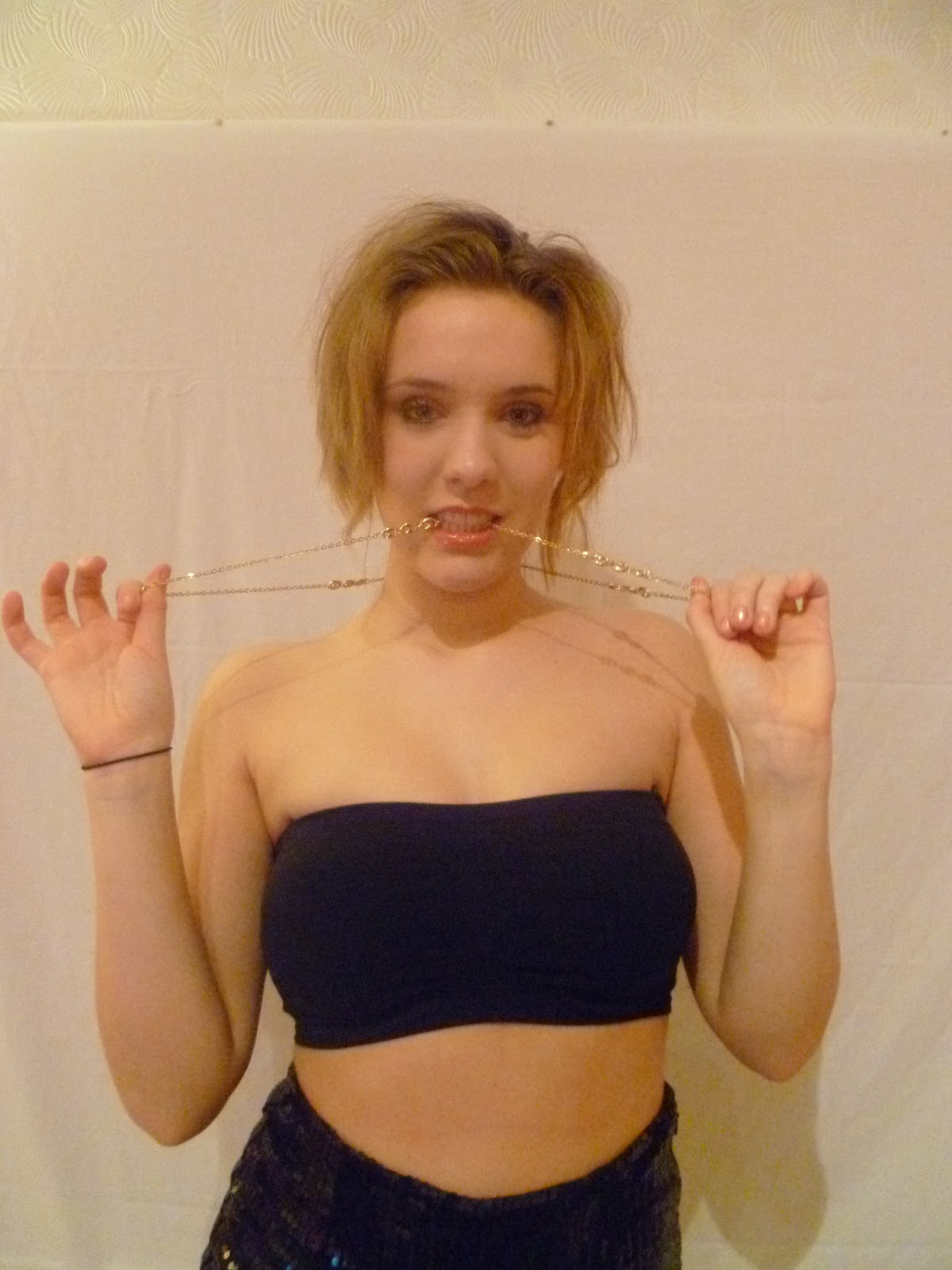
This is the image from Pixie Lott's album cover but I think this could also work on the front of a magazine. I think the chains around her neck could be too much for a magazine front cover as they're usually quite simple but I think the chain that she's holding around her head is quite a nice twist on the image.

I think this image is very nice. It shows off her shape which will attract the boys but it's also an image girls can aspire to and is a very proud image.
Thursday, 8 December 2011
Magazine title ideas
Official Chart (mag) – this came for the idea I was going to make the official magazine for the official charts company. I’ll make the masthead in the same font as the official charts company logo and I will also use the same colours and style. This could be quite difficult to do but I think it is quite a good concept.
Poparazzi – a play on words from the word paparazzi. I came up with this idea while I was at an Example gig in Newcastle as I was taking a picture of him. I like this name because my magazine is all about fresh things and meeting new artists and seeing lots of new, exciting pictures is part of this process. It also ties into the music link because stars are followed around by the paparazzi.
Pop Stars and POP! – this is what is going to be in the magazine and therefore I thought it would be an apt name. Names like this have been used before though and recently a new child-teenage magazine has come out that is called I LOVE POP so I don't think these name ideas are very original.
Poptastic – this was a term the late Alan Freeman (Radio 1 DJ) used during his time on Radio 1 and before that at Radio Luxembourg. Tony Blackburn has also used this in the past so I thought it would be good to use because of its history. It is also quite a catchy name.
Wednesday, 7 December 2011
Institution
The publisher of my magazine is going to be Bauer Media who are also the publishers of Heat magazine, Bella, Take a Break and two leading music magazines Q and Kerrang. The company also run radio stations and box television. The reason I have chosen Bauer Media to produce my magazine is because although they already publish two music magazines, they’re very different to my pop magazine. Q magazine is a magazine very much full of alternative music with a bit of chart, indie and rap music, Kerrang magazine is a rock/metal magazine. Some of the TV stations Bauer Media is involved with are those which show pop and chart music videos, therefore I think it would be an investment they’d be interested in and it’s also something they don’t own yet.
Ideology
The aim of my magazine is to encourage young people to be themselves and enjoy their own style and who they are. The artists used in the magazine will all be good role models or people with stories of how they’ve turned their lives around.
Target audience
The target audience for my magazine is going to be males and females but a majority of females with a ratio of 80% females and 20% males. The mean age of my audience will be 17/18 year olds who are in the social classes of C2, D and E. This will mean my magazine will be affordable and produced at a speed they’ll be able to get money together for. I want the audience for my magazine to be young independent people who aren’t afraid to be themselves and still enjoy typical pop/chart music.
Thursday, 1 December 2011
Subscribe to:
Comments (Atom)