These are the four images I chose to use:

This image was the other big contender to be used as my front cover image

I like this image but I feel it was very posed so it was better to be used on the double page spread

This is a lovely image but the arm took up too much of the image to work on the front cover. Once I'd cut the image out and scaled it on my double page spread, I think it works well.

This is my least favourite image of the four but I think it looks nice on the double page spread once I had changed the brightness and got rid of a lot of the orange/yellow background.
Firstly I opened the first image on PhotoShop. I manipulated the images on separate pages which made it easier to then put them all onto one page at the end and scale them.

The first thing I did to the image was duplicate it so if I didn't like what I had done to the image I still had an original copy. I then used the "quick selection tool" to select all of Evie and I then inverted the selection so I could delete the background of the image.

After cutting Evie out I wasn't happy with her hair. I looked too fake and there were certain bits of the background still left in between thin strands of hair so I used the "paint brush" tool and the "colour picker" tool to lighly paint in bits of her hair and match up the colour. I made sure the paint brust was very soft which meant the new hair didn't look too fake and once zoomed out it blended in nicely.

The next thing I had to do was clear up her skin. I did this by using the "spot healing brush tool" which you click over an imperfection and it makes it the skin colour of the rest of the image like it was never there. I had to do this over a few spots on her chin, moles on her arms and one strand of eye brow which looked out of place. You can't tell any of that was there now I have worked on it.

I then used the "clone stamp tool" which is similar to the "spot healing brush tool" as it gets rid of imperfections. I used this tool on the top she was wearing. As you can see on the image above there was a strand of thread that was clear to see when the image was zoomed out. The top also didn't look straight so I was able to fix that with this tool.

One tool that I found especially useful was the "adjustments" tool which allowed me to change things such a the colour balance, levels, brightness and curves in the image. These tools allowed me to change the images appearance a lot. I tried to make the image look less orange and a more natural colour.

Following all of this extra work I put into the image, I blurred the edges of the whole image so it blended into a background more. This was the final step I took on the photo before I uploaded all four images onto one PhotoShop page.

This is how all of the images looked when I first put them all onto one PhotoShop page. I was then able to manipulate the images again using the "adjustments" tool so that they all looked the same colour or as close to this as possible. The image of Evie with her arm up still looks lighter than the other images but that is something I have to accept because there is less shadow on that image, and nothing I can do about it.

This is how the images looked when they were set up on the page properly after I had scaled them down and put them in their own boxes. Overall I like the layout of this double page spread so far but I definitely need to incorporate colour onto the page which could be difficult with this layout. I am going to use the images I have manipulated again to see if I can create a better product. This could also be an odd design because it is for a solo artist, designs like this would usually be used for a band.

This is how I started my next attempt at a double page spread. I just decided to mess around with the paint brush and then actually ended up using this as my final design. The box that is on show in this screen shot is where you choose the size of your brush on PhotoShop. I used the biggest brush that there is and set the hardness so it was very low which meant the colour would be light.

I decided to use this turquoise colour because I thought it was a neutral colour for both genders. This shows how faint the colour was but I liked it!

Once I had covered the whole page in the turquoise colour I decided it needed more colour. I then used blobs of the same pink I have used on the front cover and contents page for continuity and randomly placed them across the page. The paint brush was also large and soft for this.

I then decided to use some smaller white circles to finish the background off. I think the white circles made it look slightly Christmassy and it also broke up the colour a little bit, following continuity of the texts boxes I would create later.

This again shows how I chose the size of the paint brush and and the hardness of it. I then placed the centre line on the page so that I knew where one page would end and the other would begin. This was important to do before I started adding anything else to the page so that none of the images or text were only on half a page.

I then copied the image of Evie off my other double page spread so that it was already manipulated and I was happy with it already. This saved me a lot of extra time.

I then scaled my image on the page. I decided to keep her this size because her head went off the page on most double page spreads like this and also because only a small bit of her arm went onto the next page. This isn't that important because it isn't an important feature of her.

I then created a banner at the top of the page saying that this was an exclusive interview with the artist. I later changed the colour of the word exclusive to red as this is a conventional colour to used in music magazines and it makes it stand out on the page which is important.

I also decided to change the brightness contrast of Evie too. After looking at the image for a while whilst doing the rest of the work I thought she looked a bit too dark so I changed this level slightly.

It was then time to create the columns I was going to put my text in. I turned off the other images on the page so I could just focus on making everything equal. I used the shapes bar to create one rectangle which I sized up and then made a copy of. Once I had lined them up together, I then used the eraser tool on full hardness to cut out a circle in the middle which I would later add a pull quote to.

I then used the same system as before and copied the rectangular image and then lined it up with the others to make a third text column.

I then put Evie back on the page to see how she fit with the columns. I didn't have to do anything to change the image and the columns. I liked the fact her arm would mean i had to shape the text. It would give the finished product more edge.

The next thing I did was read the text through again to find a pull quote that I could use. I then used the text tool to type this into the cirlce I had created and then scaled it to the size that I wanted.

I then created an icon or flash containing the words "cover story" indicating that this is what was on the cover. This is a common feature of other pop magazines.

Page numbers were a small matter I had to deal with. I decided to make them white with black writing so that it was continuous with the rest of the page, as I had used white text boxes for the article.

I then created a caption indicating where the image is from
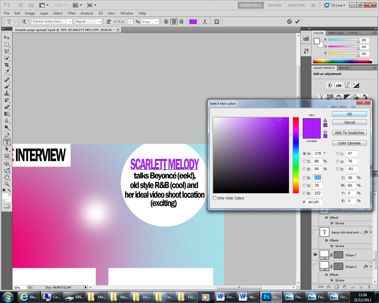
This is how leading paragraphs are presented in pop magazines. I decided to follow the same trend but I made the name of my act stand out by changing the colour of the text to a purple which I would then use for other bits of text on the page. I also didn't use a drop cap and just stuck to capitals as well because drop caps are very rarely features of pop magazines.

I then created the headline of the page which is slightly different in pop magazines, they just use another pull quote and enlarge it which is what I did. This is how I rotated the text once I had created it and changed the colour of the text to purple.

This is how the page looked when I first imported the finished image into Microsoft Publisher. The text I had created was underneath the image.

I used the send backwards tools to make the writing appear again section by section and I was then able to adjust the text if I needed to.

This is how the my media text looked at the end of the process as I was changing the colour of the Poparazzi journalists questions to make them stand out from the rest of the text, again using purple so it was continuous.
No comments:
Post a Comment