Thursday 24 November 2011

VIBE LIIAR analysis


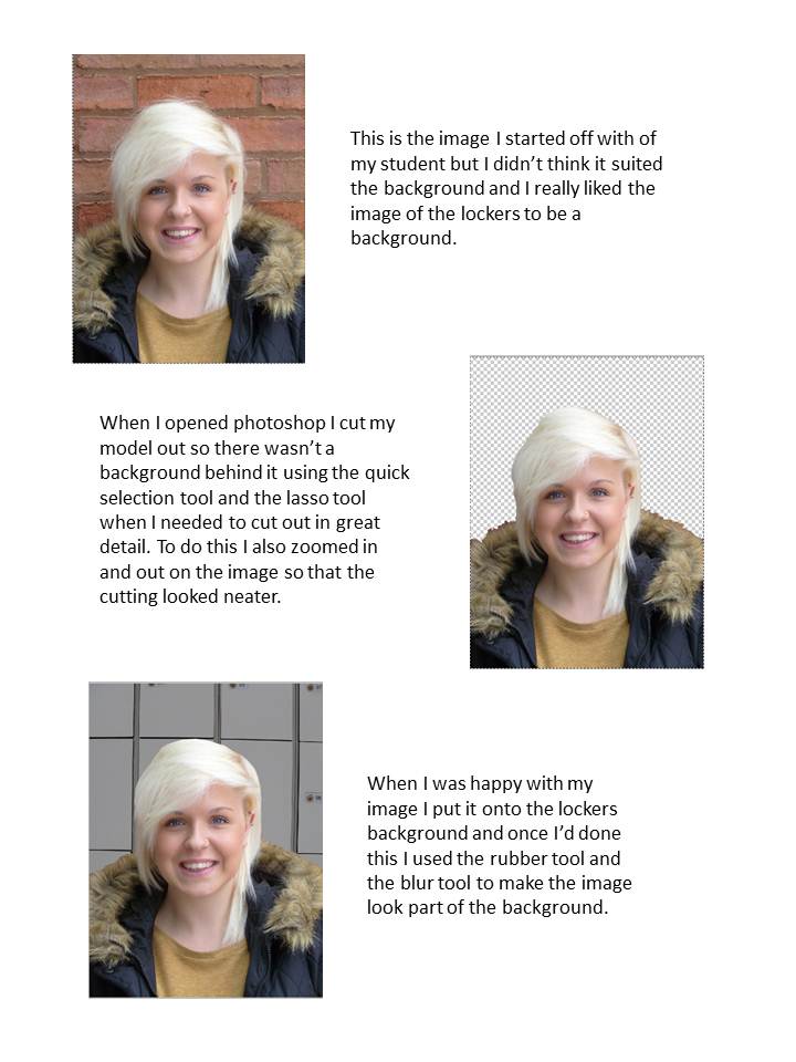
Language – this is a very simple looking front cover for the music magazine. It has a very basic colour scheme of pink, white black and blue which work very well for this cover. As the main background is blue a white masthead is used so it stands out. The font is a san serif font as it is a main convention. White is also used as the predominant text colour for the other headlines on the blue background but pink and black are used on the white background so we can see the headlines. The main image (Nicki Minaj) is dressed in three of the four colours so she’s relevant to the rest of the cover. This front cover does not typically follow all of the usual conventions of a magazine front cover as the text isn’t all in the left third and there aren’t any flashes, smaller images, etc.

Ideology – the ideology of this magazine is for new and alternative music to be portrayed to the public along with American Billboard chart music. They want the music scene to be "fresh".

Institution  Vibe was launched in 1993 by Quincy Jones in NYC and was partnered with Time Warner Inc. In 1996 Miller bought Vibe and they owned the magazine until The Wicks Group of Companies bought it in 2006. On 30th June 2009 Vibe shut down although a private equity fund called InterMedia Partners bought the magazine and are now working on a new brand.

Audience – the audience for this magazine are young people from teenagers up until their early thirties. The audience is predominantly females although males are targeted at too.

Representation – this front cover represents women in a strong and powerful way. Nicki Minaj (the woman on the front cover) is seen as somebody who stands up for what she believes in and is a headstrong woman. Her pose emphasises this view as she’s stood with her hands on her hips which could be seen as a arrogance and her legs been apart also adds to the attitude along with her tongue sticking out. The images at the bottom of the magazine cover though could create an innocent feeling about the cover as it is an array of small animations.

Kerrang LIIAR analysis


Language – this magazine only sticks to a few of the usual magazine conventions. The masthead is done in a san serif font which makes it bold an stand out and the white text on the black background adds to this. This is also a display font meaning it wouldn’t be used again in the rest of the magazine. The connotations of this type face is that of a smashed mirror. This could be linked with the  genre of music and the fact it can be turned up that loud it would smash mirrors. The main image on this front cover is almost centralised and this has allowed them to put text and images on either side of the main image. The main headline which is linked to the main image is in a banner which goes right across the page. This as a background is also dark with red text on it which follows the theme of the rest of the magazine front cover. A lot of smaller images are used to advertise what else is in the magazine. A splash is also used as a screamer to advertise a prize that can be won.

Ideology Kerrang is all about rock and metal music from all over the world. It is a way of interaction for all rock and metal lovers shows an understanding that it is not wrong to like that type of music.
InstitutionKerrang was first published on the 6th June 1981. To begin with it was a one time supplement in the Sounds newspaper which had a focus of the new wave of heavy metal in Britain and other rock bands. Angus Young from the band ACDC was on the first ever cover. Originally Kerrang was owned by United Newspapers but they then sold it on to EMAP in 1991. In 2008 Kerrang was then sold on to Bauer who are the current owners of the magazine.

Audience – the mean age of the Kerrang reader is 22 and it has an ABC1 profile meaning a lot of its readers are in the upper class or people with good jobs. It has a circulation of 44013 and a readership of 396000. 87% of it’s readers buy every issue which is produced on a weekly basis.

Representation – in the main image Jared Leto is starring straight into the camera clenching one fist against a flat palm. This beard/stubble gives him a rough edge and the clothing he is wearing does too. These connotations go with his reputation and the type of musician he is. His eyes are very blue which creates a slight innocence to the way he is. Also on the cover there are other pictures of stars just looking like they’re enjoying themselves.

NME LIIAR analysis


Language – this edition of NME is a special Christmas edition which influences a lot of the conventions on this magazine front cover. To begin with the colour scheme on this cover is grey and black with white snow and Christmas red. This sticks to the Christmas theme and also makes the components stand  out. The masthead is in red because this makes it stand out and it’s also in san serif font along with the other main headlines. It also has snow on the top of the writing and the splashes on this front cover are all in the shape of Christmas tree baubles. All of the text is in the left third so the main image dominates the right third along with the bar code. Above the masthead is a skyline which is also related to Christmas and an advertisement. The subtitle is in serif font and smaller than the main headline because it isn’t as important.

Ideology – the idea of NME is to encourage different music and allow people not to follow the crowd and be proud of their individual music tastes. It’s all about new music and new ideas. This edition is a special Christmas edition which incorporates Christmas ideas.

Institution – NME is published by IPC Media. Originally NME was published as a non-glossy tabloid publication but it then became a music magazine in the 1980s. In 1996 NME started being published on the internet which now has 5 million users every month.

Audience – the target audience for the NME is men between the ages of 17 and 30. This doesn’t just mean it sells to those people though as 73% men buy this magazine and 27% women buy it. The average age of the consumer is 25 years old.

Representation – in the main image Simon Cowell is looking straight into the camera which creates an automatic bond with the audience. His eyes look slightly evil and scheming and the whites of his eyes are very bold and bright apposed to the pupil. His mouth is on a slight angle and he is almost smirking at the camera. He doesn’t look particularly grim like the Grinch is but he does have an edge  to him were it’s almost difficult to understand what is going through his head.

Wednesday 9 November 2011

Music magazine preliminary brief

To produce the front page, contents and double page spread of a new music magazine. All images and text used must be original, produced by you. Minimum of four images

Evaluation

My magazine cover uses quite a few conventions of a real media product in the form of a bright bold masthead and the sell line underneath this. Yellow is a popular colour in media to create titles and it also works well with most other colours. I’ve also used the left third very well by putting all of the headlines there and the main headline is bigger than the others which attract attention to it above the rest of the stories. The bar code is in the bottom right of the image which is also another regular place to put it along with the price, date and issue number above it. I’ve also used a splash which is a small animation which is generally also put in the right third. The image is a large image which fills the whole page. She is looking straight into the camera which creates a connection with the audience straight away and also allows us to see the emotion in her eyes. I got the title of my magazine from the prezi which I created and I chose the one which I thought was the best. It’s a slight play on words in relation to the cover line as this is have your say.

The ideology behind my magazine front cover is to encourage people to be who they are at college, work hard but try to enjoy their  time while they’re there. The advice pages in the magazine are there to help people with their problems but also to encourage people to help others with the hard things they are having to deal with. It will also hopefully make people realise how lucky they are to have a great education and encourage them to use their knowledge wisely. Some stories will also be focused on subjects outside of the college which will also allow other opportunities.

My front cover represents college students in a very good light because the student I’ve used is very happy which is what you would want from a college student. Her smile lights up her whole face and she has a happy sparkle in her eye too which adds to the effect. Her cheeks have a healthy glow in them which also portrays the college very well and makes it seem like been at college has made her this way. She’s wearing nice clothes and doesn’t have a hood on her head which breaks the stereotype of teenagers been trouble makers and rude.

I think this can relate to both males and females although this cover could possibly relate more to females. If a male was used I think it would make the boys more likely to buy it.  I also think this could be a good place for teachers to give out information and help students anomalously if they need to but from this design I’m not sure they would do that. The sports pages in this magazine will attract a different audience to science pages or language pages. These different features will attract a more varied audience. To attract a good audience and allow for production costs I’ve made the magazine £1.00. This will be affordable for the students but there can also be a lot of advertisements in the magazine which will pay for extra production costs.

To create this image I had to learn how to use photo shop properly which made the experience longer and more difficult but by the end of the task I was using it very well and I was able to manipulate pictures quite professionally. Firstly I took my images and imported them onto the computer. I then cut out the image of my model and put it onto the new background I had. I blended the images together so they looked realistic and then added the other components to the image.

The feedback I’ve had on my cover is mainly positive about the colours used and the image I’ve taken. The size of the image has been positively commented on and so has the use of the yellow for the text. It’s also been said the smile on my models face is a nice representation of a college student.  The only issue with this is the back drop. I was told it could’ve been thought about slightly better but this is a lesson I can learn from.

My final design


Because this is my first attempt at using photo shop I am pleased with my end product and I hope I can improve on this for my music magazine but it was a great experience.

Draft contents page

This is my first idea of how I would like my contents page to look. I'm not sure it suites the college magazine but I think it could work for a music magazine.

Production screen shots

Tuesday 1 November 2011

Magazine front cover images


This is the first image I took of India with her coat on and indoors against a blank wall. I took a few variations of this picture, some horizontal and some vertical, some with the coat and some without. I took it against a blank wall so it would be easier to cut out on PhotoShop if I needed to.


I then took pictures against a wooden door which gave me a different background option and I also took these images in the same way as the first ones, with and without the coat, and horizontal and vertical.


I then took some pictures against the lockers to see what this background would look like in my pictures.


I really like the pictures of the bricks in the background but I wasn't sure it would work very well with the rest of my magazine cover. I don't think the colour scheme would've worked too well and I think it would've made the picture too 'busy'.


I really like this image. I think it looks really good but I didn't think it was front cover material because of all the different colours in it. I think I would use this inside the magazine though because I think it represents college students really well.


I also think this picture would work really well in the magazine especially in the sports section. It could also be manipulated with another magazine to advertise another subject we do at the college.


I also took pictures of another student working in the library and of a group of students together to show them socialising while they're doing their work.