The ideology
behind my music magazine was to create a media text that allowed teenagers who
enjoy the pop genre, to express their love for the music and have a platform on
which they can celebrate it which isn’t available to them at present, only
younger children. I wanted the magazine to include role models that young
people can aspire to and which allows them to be themselves.
In what way does your media product use,
develop and challenge forms and conventions of real media products?

The main
image is a medium close up shot which is similar to images on the front of most
magazine covers. In some of my previous drafts of my front cover I decided to
use a long shot which didn’t follow the conventions of a regular music
magazine. I always wanted my front cover to be slightly unconventional because
most pop magazines on the market that are for younger children do not follow
the same conventions as magazines such as NME, Kerrang and Q. Because of this,
I decided to make the colour scheme for my magazine more conventionally pop.
Pop magazines use a wide range of colours, not just the typical red, yellow,
black and white. A lot of pop magazines use pink, green and orange. Because
this magazine has a main target audience of females, I decided to use the
stereotypical pink on the cover along with a more conventional use of yellow.
On my original drafts I had kept the colours I used to a minimum and although
they weren’t conventional colours to use, I think the cover still looks better
with more colour. Something I noticed about my earlier drafts was the over-use
of the colour black, I think this detracted from my intention for the magazine to
be light hearted and fun. To change this I decided to remove the block black
and make more of the text black so it would stand out better on the other block
colours. An example of where I did this is on the skyline. The masthead was
also black which I didn’t like so I made this pink, with a black outline, so it
still stood off the page. Another change I made to the masthead, which is very
unconventional to a normal music magazine but fits in well with the pop genre
is to replace the “O” in “POPARAZZI” with a heart icon. I am really happy with
how this looks on the page. The skyline at the top of the page is something
that appears on most music magazines. Although it isn’t used every time on a
pop magazine, I like the look of mine in relation to the rest of the content on
the page. Something that I had to make a big decision about was the layers of
the images on the page. My magazine uses the idea of thirds well. There is a
lot of detail in the left third and the main image is slightly off centre
towards the right third which is a common occurrence on most magazine front
covers. Something I had to consider when looking at existing pop magazines is
that usually they aren’t just focused on the music but have a lot of celebrity
gossip in them too. When creating my cover this meant I had to think of
different ways to fill the blank space on the front rather than focusing on
fashion and gossip. I think adding one more music related story to the cover as
a regular feature within the magazine would be a way to improve what I have
already created.

The contents
page does not look like a typical pop magazine contents page and this is
because I used Kerrang as my influential media text. I decided to do this
because looking at the front cover, contents page and double page spread in a
pop magazine, it is the contents page that looks the youngest and my target
audience is older teenage girls. I felt it was important to keep some aspects
of the contents page similar to existing pop magazines though things such as,
the colour scheme, images used and a message from the editor. The colour scheme
of a pop magazine contents page is very bright, just like the other pages in
the magazine. For this reason I chose to use the same pink used on the front
cover keeping continuity A lot of images are used on contents pages too so I
did the same but unlike in existing pop magazines, I decided to put the images
into columns to make it look neater as in Kerrang. The message from the editor
is also similar to Kerrang but recently in pop magazines such as Top of the
Pops, messages from the writers have been featured. Something I decided to
include on my contents page which isn’t heavily featured in many magazines is
the social network information for the magazine. Because of the way media is at
the moment, social networking sites being a large part of that, I thought it
was an important aspect to include and because if this I also decided to
include a subscription option too. This is featured in some magazines but not
in any pop magazines I have looked at. Overall I think my contents page keeps
to the conventions well although they are a mixture of pop conventions and
general music magazine conventions. I think my inclusion of social networking
sites shows that I understand the media currently and also my target audience
and their habits.

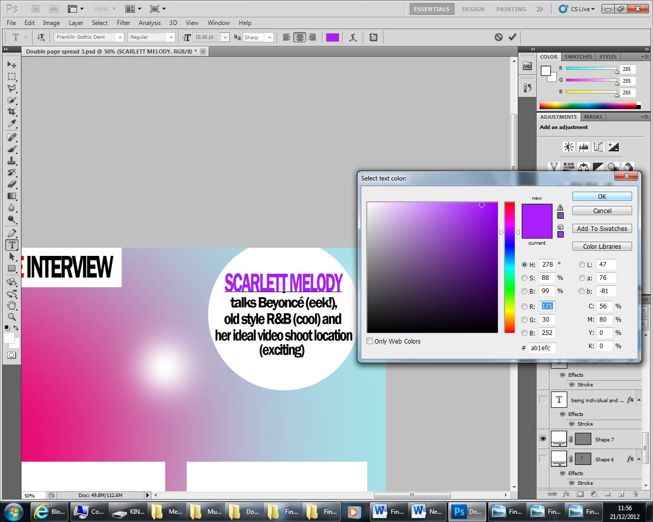
My double page spread has improved greatly since my
first submitted entry. I found this the hardest to do at the start of the
project but once I had a better understanding of pop magazines I think this was
the easiest to maintain. The use of one main image comes from the influences of
Top of the Pops magazine and We Love Pop. Their double page spreads tend to
contain one main image and an interview. That is another decision I made which
was a vast improvement on my first draft. I had written an article about the
artist but after looking through pop magazines these are not featured on double
page spreads. The text is in an interview format, and a “chatty” interview at
that. Most of the double page spreads I looked at featured a competition with
the main artist from the cover image but to maintain continuity I chose not to
do that because my front cover, advertised a competition in the flash to “win
tickets to see Rihanna”. Something else that I haven’t included on my double
page spread is a drop cap. In most music magazines they are conventional but
pop magazines don’t often include them so I made the decision not to include
one on that basis. They also don’t usually have a main headline and just use
another pull quote and enlarge it to entice the audience. This is something
else I decided to do to make it a conventional pop magazine although compared
to other music magazines it could be seen as unconventional.
Following
the production of my magazine I created and conducted a questionnaire. Doing
this allowed me to use the responses to improve my product for the second
submission. One of the questions I asked was: ‘How would you improve the front
cover, contents page and double page spread?’. A common answer to this question
was to incorporate more colour in all three pieces rather than just black and
pink, especially on the front cover. Taking this on board I have now added
yellow, white and green onto my front cover. I think it has made the cover look
more believable as a pop magazine. I didn’t add any colour to my contents page
because I thought it worked well already but I completely changed my double
page spread and used a lot more colour on this. I really wasn’t happy with my
double page spread because I didn’t think it came together as one product. Creating
a background so it wasn’t plain white has really helped the double page spread
blend together and become one. It also meant I could incorporate the extra
colour and make it more “poppy”. One thing that was commented on was that they
liked the continuity of pink on every page, I took this into consideration too
and made sure this continued on my updated products.
The images I
had used were also another big thing that were commented on in my
questionnaire. Most people said that the image on the front cover should have
been a medium close up rather than a long shot. In my early photo shoots I only
took long shots but since then I have taken medium close up images and I
decided that these did look better and are also more conventional. A few people
said that they wanted to see more images on the contents page so that it looked
more “busy” but I disagreed with this and decided to keep the number of images
the same. I did however change the image on the double page spread. Looking at
other pop magazine double page spreads, it did need a larger image to remain
conventional. The image on the double page spread wasn’t mentioned by anybody
in my first questionnaire results but it was a decision I felt I needed to
make.
The changes
that I made to my media texts after reviewing the questionnaire responses were
reasonable. After finishing my media texts again I completed another
questionnaire and found that 90% of the people asked preferred my front cover
with the medium close up image and more colours. 24% of the people asked said
that they would have preferred the cover if colour was added to the background
or there was another story at the bottom of the cover. They said that they felt
there was something missing. The contents page received similar comments to the
last questionnaire which involved comments been made about the number of images
and the size of the text on the page which was said to be too small. Two media
students said that they didn’t like the block colour of the subscription
feature, they said it was “too much”. One media student also said that I could
have included a tease line along the bottom of the page as a way of including
an extra feature. The double page spread received more positive comments than
last time and 100% of the people I asked said they preferred my new double page
spread to my old one. They liked the fact that I had included a larger image of
the artist and that the background was no longer plain white.
How does your media product represent
particular social groups?
The social
economic groups I decided to focus on were from the groups C2, D and E. To
represent them properly I researched what these people did in their spare time.
I interviewed a girl from the age group and social economic group of my target
audience (can be seen here: http://jennnnnwilson.blogspot.co.uk/2012/11/psychographic-information-video.html) to see what she spent her money on and what
she was interested in. I already knew from other research I had conducted that
they spent an average of £450 a year. Music is important to them and 95% of my
target population own a music playing device. 65% of them spend money buying
music either as a hard copy or as a downloadable version. 100% of them use the
internet spending an average of 2.8 hours a day on there. 78% said they have
worked at some point and they earned an average of £180 a month. Not all of my
audience will have left school, some will be at college or university, in full
time work or on apprenticeships. When I asked friends from college what pop or
chart music they listened to, Rihanna was very popular so I decided to include
a competition on the front page with an opportunity to win tickets to see
Rihanna perform live. The artist’s names in the skyline and also in the
featured images on the front cover and contents page were also mentioned, they
too fit with the ideology of the magazine. Because of the amount of money they
receive or earn a year being low I have set the price of my magazine as £2.10.
When asked about the pricing of my magazine in the questionnaire the most
popular price people would pay for my magazine was £2.50 followed by £2.00.
This is a positive response considering the price I had chosen to sell my
magazine at. When looking at weekly magazines that are already on the market,
they are all under the price of £2.50. NME and TOTP are sold for £2.40 and
Kerrang is sold for £2.20. I used these price ranges to decide what to charge
for my own magazine. I also created the chance to subscribe to the magazine
which means they will get the magazine 20% cheaper making it even more
affordable for people with a low income.
Here is a graph showing the results:

What kind of institution might publish and
distribute your media product and why?
After
researching many magazine publishers such as IPC Media (http://www.ipcmedia.com/) I decided that Bauer Media would be the
best publisher for my magazine Poparazzi as they run 300 different magazines
across 15 countries. In 2008 Bauer Media joined the Bauer Media Group who were
well renowned for producing magazines and radio. The multi-platform UK based
media group launched their first magazine in 1953 which was the Angling Times.
This was followed by the Motor Cycle News which started the Bauer Media Group
we know today. Bauer Media pride themselves on their understanding of the
audiences they’re reaching out to and with the results of my questionnaire, I
believe I have targeted my magazine well to the audience I am aiming for.
Another big success came for the group when they bought what was then a small
magazine named For Him Magazine but this is now known as FHM, the best selling
multi-platform brand in the world. Some of the current magazines they have on
the market are either music magazines or celebrity gossip magazines are Kerrang,
Heat, More!, MOJO and Q. My main target audience was females between the ages
of 15-21 and the only similar magazines are Heat with an audience of ABC1 women
aged 16-35 and More! with an audience of women aged 18-24. Neither of these
magazines are purely music magazines like mine. The music magazines they have
on offer are Kerrang, MOJO and Q and they are all aimed at males that have an
acquired music taste. Bauer Media also own many radio stations across the UK
and bought the digital TV music channel ‘The Box’ in 1996 which offers a range
of chart music. This reassures me that they are aware and interested in the
type of music my magazine has to offer and that they would be perfect to
publish my magazine. (http://www.bauermedia.co.uk/)
Who would the
audience be for the media product?
How did you attract or address
your audience?
At
the beginning of the project when I was researching magazines to use as
inspiration for my own design, the pop magazines on the market already such as
TOTP (http://www.totpmag.com/) and We Love Pop (http://www.welovepopmag.co.uk/) seemed to be targeted at a
young audience and weren’t just about music, they included fashion tips;
celebrity gossip and advice pages too. I knew I had to change this to meet my
brief and also to make the magazine appeal to an older teenage audience because
they will be more interested in the music. The most important part of making
the magazine appeal to the right audience was getting the front cover right. I
used a teenage girl who was 16/17 and that automatically showed the public who
the magazine was for. The amount of makeup Scarlett Melody I wearing makes her
look as though she is about to go out and an artist may not be shown like this
on the cover of a child’s magazine. She is also in a deliberately posed
position which is another indicator. The way Melody looks could also attract
the attention of a male audience and make them want to buy the magazine too.
The fact I didn’t use a middle aged person also encourages a younger audience,
not only because they can relate to a teenager more but because somebody who is
middle aged wouldn’t have a career in the pop industry. The colour scheme is also an important part
of attracting the right audience, it gives away the genre of the magazine
because bright colours are used, it couldn’t be a heavy metal magazine and the
stereotypical colour pink reaches out to the female audience.
In my
questionnaire I asked what age range they thought the magazine was aimed at and
at which sex. The age range options given were 6-11, 12-14, 15-21 or other. 85%
of the people asked thought the magazine was aimed at 15-21 year olds which is
the age range I was aiming for. This shows the adjustments and decisions I have
made reach the intended audience. The other 15% of people opted for 12-14 year
olds. Interestingly the 15% were all girls and that’s who the magazine is aimed
at. This could indicate younger girls may want to buy the magazine too or that
some older girls wouldn’t. When asked about what sex the magazine was for 79%
said it is aimed at females and the other 21% said it was aimed at both sexes.
This is also the result I wanted as my target audience is 80% females and 20%
males. 2 males said it was aimed at both males and females which shows they
would think about buying the magazine.
Here is a pie chart to show how often people would buy the magazine:

Pop
magazines generally don’t have a colour scheme and they use a lot of different
colours throughout the magazine but again to make this reach out to an older
audience I decided to use a colour scheme although it isn’t too conventional.
Front covers of magazines usually use colours such as red, yellow and black but
using pink and green meant I was giving the magazine a pop twist and hopefully
reaching the audience.
Other things
that attract an audience are competitions, the artist’s names featured and
images. I decided to use a skyline on my front cover and here I listed some
artist’s names that are inside the magazine. This is a selling technique that
allows people to know what to expect without having to pick the magazine up and
search through it. The artist in the main image also attracts the audience
because if you like that artist you are going to want to buy the magazine to
see what they have to say. I also used a flash containing a chance to win
tickets to see Rihanna. If you’re a big fan you’re going to want to buy the
magazine to have a chance to win the tickets. Every week there will be
different featured artists on the cover and this will entice a different
audience. There will be some people who buy the magazine weekly and then there
will be some people who buy it every now and again when the features appeal to
them. I decided that this magazine would be published weekly as there is a gap
in the market for a weekly pop magazine and in my questionnaire I asked the
question ‘how often would you buy the magazine?’ The results I gathered
indicate that there is an audience that would buy my magazine on a weekly basis
and the second most popular result was monthly. Some people said they would buy
my magazine every two weeks which is also good. The 14% of people who said they
would never buy my magazine were males which is fair because my magazine is
aimed 80% at females. They may also not buy my magazine because pop music is
not the genre of music they listen to.
What have you learnt about technologies from
the process of constructing this product?
Throughout
this process I have not only learnt a great deal about Photoshop but I have
also learnt a lot about creating animations online using GoAnimate, how to
collate all my thoughts and opinions using Prezi as a part of my planning, how
to upload videos onto the internet and how to run a blog using the website
Blogger.
I found
PhotoShop very difficult to use at first because I had not used it before. Even
the simple things I wanted to do were taking a very long time and at times I
found it very aggravating. Every time I started my work I forgot to make a duplicate
layer of the original image which was very important to do in case I did
something to the image that was irreversible and needed the original image to
start the process again. I found out early on in the process that you can only
undo a certain amount of work you have done to an image before you are left
with something you still aren’t happy with. When I got into using PhotoShop
properly I found it useful to save my work regularly and also if I liked what I
had done to an image, duplicate that layer in case again I made an irreversible
change later. I would then still have a copy of the image I liked. This was a
routine that I just had to get used to . Something that took me a very long
time to work out was how to edit the text I had created once I had clicked off
the layer. At the beginning I deleted a
lot of the text at times to start it again because I didn’t know what else to
do. I then realised that clicking back on the text layer and still using the
text tool you could highlight the text and change it however you wanted to. This
technique became very useful to me at the end of my first submission when I had
to change all the typefaces so they weren’t the same as the masthead. Another
tool that I discovered which made me work quicker was the quick selection tool.
Before I had discovered this I was cutting around the edge of the image with
the polygonal lasso tool which took a very long time and it meant that the edge
of the image was very straight and looked unrealistic on the page. I then had
to go around the edge of the image again using the blur tool to make the image
blend in to the rest of the background. At the beginning of the project I also
struggled to change the size of the image. When I learnt how to do this using
the transform option in the top tool bar I was able to manipulate the image in
a lot of different ways including rotating the image, scaling in and flipping
the image. The more drafts I produced of my media texts, the quicker and
slicker I became with PhotoShop which helped me greatly. When I first started
to redraft my second submission of the coursework I found it hard to use
PhotoShop again because I hadn’t used it for so long but I quickly became
familiar with the tools again and I am now better than ever at using the
programme in the right way. At the beginning of the task I used videos on
YouTube to help teach me how to use Photoshop. These videos feature in previous
posts that I have created on my blog.
GoAnimate
was a website that I was introduced to by one of my friends. They showed me a
quick video they had made for another subject and I really liked the idea so I
decided to create an animation video myself. I used the website to explain my
progress and I did this as an interview. It was an easy way to show how I was
feeling about the progress of my work and it was also fun to make. The one
issue I had with the website is that to make long videos with a lot of
characters you had to pay a lot of money so I could only use minimal tools on
the website.
Prezi
presented me with a few issues throughout the process. I didn’t like using the
website at first. I didn’t think it was very useful but that was mainly because
I wasn’t sure how to use it properly. When I became familiar with it and
changing the settings of my creations, I began to like it and I was able to
create Prezi’s well. I also learnt how to put images onto them so I could look
at more ideas for my media texts. Prezi updated a few times while I was using
it which meant I kept on having to learn how to use the website again but I
think it was worth the hassle because of the ideas I was able to develop on it.
My blog has been a great way of keeping
track of my progress and giving me something to use to help me write my
evaluation. Originally I didn’t use my blog very well and I wasn’t putting much
on there but as time went on I got better at showing my progress. This is
partly to do with using my A2 media blog at the same time and I had to plan
more for this. When I first started using my blog I was uploading images and
hyperlinking videos to my blog and nothing much else. I have started to use my
blog more like a diary now and I have learnt how to embed videos properly.
YouTube became a great way of being able to embed videos onto my blog and after
creating my own YouTube channel I was able to record videos and then embed them
to my blog so they were better quality videos than blogger videos. I have used
this process to film myself evaluating my final media texts and talking about
the processes and how well or badly things went when I was creating them.
The search engine “Bing” has also
helped me greatly in this process. I have used Bing to research all of the
different types of magazines that are on the market; to help me find images of
artists in photo shoots to give me ideas for poses, costumes etc and to also
find out about Bauer Media who are the publishers I have chosen to publish my
music magazine. Over the year of searching the internet I have learnt how to
narrow down my searches and also which websites to trust with accurate
information. Bing has also been how I accessed the other internet sites I have
used throughout this process and it would have been difficult to produce my
media text without it.
Now I have
had a chance to redraft my work I am pleased with my media texts and think they
are much better than my first submission, especially my double page spread. I
do think the front cover is missing a feature but apart from that I think this
front cover fits the genre of pop better than my first one. I haven’t changed
much on the contents page because this is the piece I was happiest with originally.
If I could change one thing on though I would use one more colour. I now think
the double page spread is my favourite because a lot of hard work went into it.
I love the colour scheme in the background and I think the image is really effective.
I’m not sure what I would do differently with my double page spread if I did it
again, I suppose I could possibly change the headline on the piece because I am
less happy with that. Something I really
like about my media texts is the use of my original images from concerts and
gigs I have attended; I think this is a special addition to my work, which
others may not have had the opportunity to include.
Looking
back at your preliminary task (college magazine) what do you feel you have
learnt in the progression from it to the full product?
This is my college magazine:

This is my first submission of my music magazine:

This is the final design of my music magazine:

The preliminary task seems like such a long time ago
and I am confident in saying that all of my skills have improved since then. My
music magazine is completely different to how my college magazine looked. In my
first submission you could tell that both of the front covers had been created
by me. I don’t think that is obvious
with the second submission as I have used the conventions of a pop magazine
more wisely. When I submitted my first front cover, I don’t think I quite let
my mind free of what I had already produced with the college magazine because
they were very similar, using only two colours and the layout was almost the
same on both front covers. Now looking at the two images together there are so many
differences. The masthead doesn’t have any backing colour behind it; I have
included a lot more colour on the pop magazine because of the genre and message
within the music, I have also used a lot more images on my pop front cover. The
way the main headline is set out too is also completely different and I have
learnt that not everything has to be completely straight on the page, adding
rotation to text or an image makes it stand out more and defines my genre
better, making it more conventional. I also opted to include a skyline as pop
magazines do tend to use them too although, sometimes images are placed over
them so they aren’t as obvious. Similarities in the media texts though are the
size of the image, I eventually decided to use a medium close up because they
are more conventional and I do think it looks better on the page. I could also
manipulate the image more because it is larger and there is more skin on show.
I have also positioned the masthead in a similar position and included a flash
which was one of the few things I liked about my college magazine. Flashes are
very common on pop magazine front covers whether they are advertising or just
making some text stand out, I therefore found this very important to include.
The one main thing that I seem to have kept consistent from producing my
college magazine and all of the drafts of my music magazine is the positioning
of the bar code issue number, date and price because it is similar to the
positioning of all the magazines I have looked at whilst doing my research.
Manipulating
images is something that I can definitely do much better now and I think that
shows in the quality of the image I have produced as my main image on the
cover. In my preliminary task I just cut the image out from a background and
placed her against some lockers. I started the process in the same way for this
main image but once she was cut out I blurred all the edges of the image and
made sure it didn’t stand out too much, that it wasn’t on the original
background. I then changed the colours within the image using the colour
balance tool, the curve tool and the levels tool, I also used the spot healing
tool to clear up her skin. These are all tools that I didn’t know existed when
creating my college magazine and even if I had known, I don’t think the images
would have been to the same standard as they are now.
The fact I
had longer to plan my music magazine really helped and that gave me the time I
needed to think of ways I could make my magazine stand out. My college magazine
was very boring and didn’t really say anything to the audience whereas I like
to think I have created a pop magazine that is appealing to its audience. The
presentation had to be right and I didn’t like how the masthead looked and
because it is a play on words I wanted it to look clever as well as sound
clever. I therefore decided to change the type face and cut out the “O” in
Poparazzi and replace it with a heart. This makes the masthead stand out more
but it also makes it look more girly, the main intended audience, and I think
it reflects the use of the “cheesy” pun well. I didn’t use anything like this
on my college magazine which shows my confidence has grown throughout the
process. Having more time to plan this media text also helped because it meant I
could look at already existing media texts, which were hard to find for my
genre, and work out how I would reproduce that. Since submitting my first draft
I have been to more music events which meant my second submission included more
of my original images making my product more authentic.