Thursday, 16 February 2012
Price of my magazine
On my first draft of the front cover I made the price of my magazine £2.99 but after doing more research I have discovered that most weekly magazines aren't any more than £2.50. NME has a price of £2.40 and Kerrang has a price of £2.20 so I have decided to price my magazine at £2.10 because it has a younger audience to these two magazines, it needs to be more affordable but it still follows the pricing norms.

Second draft of front cover

I am a lot happier with this front cover than my first one but there are still things I can change on it. After looking back at examples of front covers and discussing with other people, I realised i have used the same type face for the whole front cover so I need to change that. The masthead usually has it's own type face so that it stands out against the rest of the front cover. I am happy with the type face for my mast head so I will change the rest of the fonts.
Tuesday, 14 February 2012
Original double page spread design
The aim of my double page spread is for me to have a picture of my artist laying down on her side or on her stomach looking very "normal" without much makeup and dressed very feminine. I want this to be the way she would usually look as an every day girl and then have a few images front the photo shoot I did for my front cover down the side almost like her alter ego. I want the article at the bottom of the page to be very natural, possibly in interview form to that my artist can explain her new fame but what she's really like and her views on life.

Monday, 13 February 2012
Double page spread images
When I was taking the images for my double page spread I had an idea in my head that I wasn't sure how to produce. For this reason I'm not sure I'm completely happy with the outcomes but after I have created my first draft I could possibly take some more images until I'm happy with the finished product.
The first few images aren't long shots as they don't include the whole body. For this reason I will not want to be using any of them although in my opinion they're some of the best images.


I think this is my favourite image of the ones in this position but it's too dark to use and her whole body is not in the image.

I like the position of this image but the photo is very out of focus and her whole body isn't in the image.


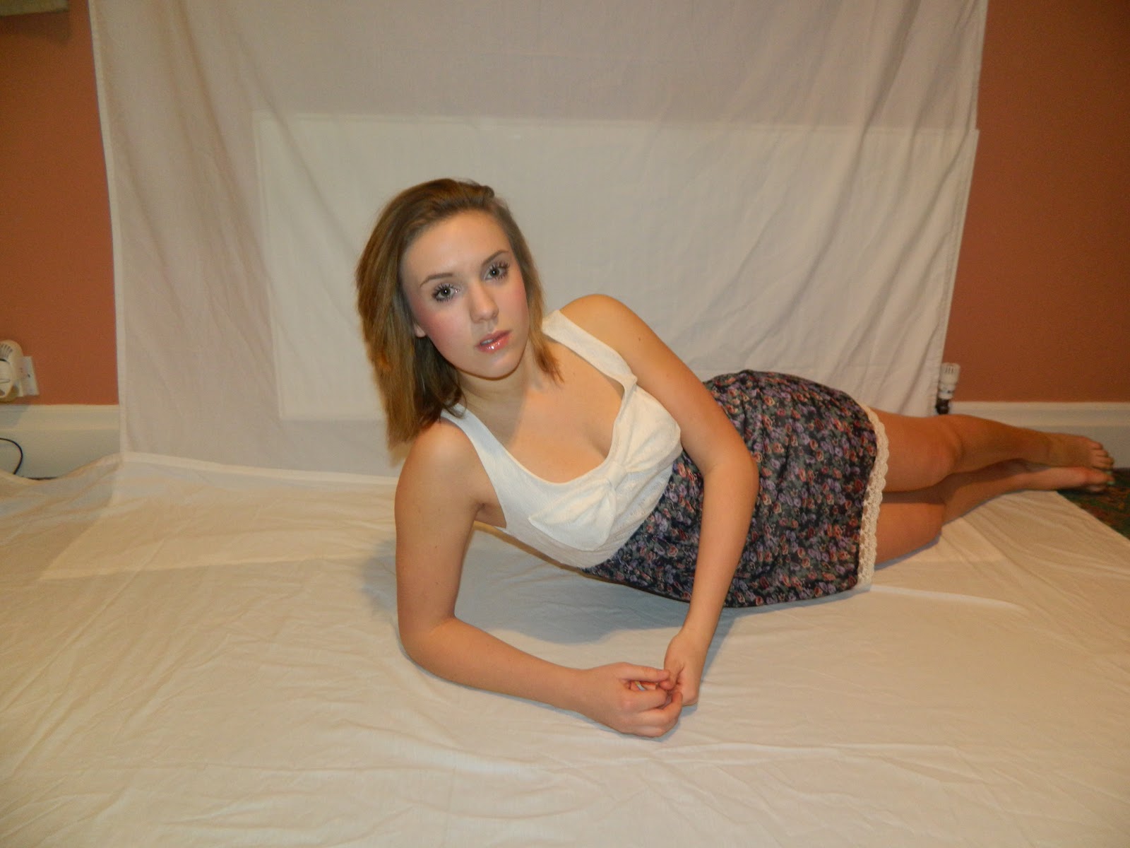
This is a potential double page spread image. I really like this one although it isn't like the idea I have in my head but that isn't necessarily a bad thing.


The first few images aren't long shots as they don't include the whole body. For this reason I will not want to be using any of them although in my opinion they're some of the best images.



I think this is my favourite image of the ones in this position but it's too dark to use and her whole body is not in the image.

I like the position of this image but the photo is very out of focus and her whole body isn't in the image.


This is a potential double page spread image. I really like this one although it isn't like the idea I have in my head but that isn't necessarily a bad thing.


I found the images I took on the chair didn't work out like I'd wanted them to. I thought they would look a lot different and I found it really difficult to make the photos like I wanted them to be.


Wednesday, 8 February 2012
Double page spread photo ideas

I like the way Pixie Lott is sitting in this image and I think with manipulation this could be a good image to recreate.

This is a good image if I wanted to use a chair in my image which could be an option so that there was more going on on the page. It's definitely something I can think about doing.

This is a really lovely image and ideally the kind of image I would be wanting to take. I like the floral theme and this is something I'd thought i could do in my image. The only change I would make to this image is the direction my artist will be laying. I would want her legs to go out to the right of her.

This image is very interesting and similar to the one above. This is also very much like an image I have in my head that I would like to take.

This image is lovely and very similar to the one I would like to take. The only difference is how she's holding her head on her arms but this is another pose I can consider.

I like the fact Beyonce is laying down in this image but I would like a long shot image of the whole body rather than a medium shot like this one.

This is a very nice image, I like the fact that it is black and white and this is something I could consider for my double page spread image. I would have to have the end of her leg in my image though as I want it to be a long shot.

This is a very interesting image and it would be cool if I could recreate this. I like the clothes she's wearing and I think it is very unique.

This is a very colourful image and I really like it. This is something I wouldn't think of doing. It suits this star but I'm not sure it would be appropriate for my artist because I don't think she would be as quirky as this.

I like the idea of using a chair in my double page spread image although I don't think an image like this would work because it isn't a long shot. I would like my image to be place on the page like she's sat on a background and a MCU like this would not work. I can use this as an idea though and create a long shot.
Monday, 6 February 2012


Thursday, 2 February 2012
Photoshop Tutorial Skin Tone - Creating a Tan
Above is
the video I watched on YouTube to help me when I was trying to create a tan on
Evie. I found this video to be very useful.

This is how I selected the skin using the quick selection tool like it showed me on the tutorial. I was then able to use colour balance to create a natural skin colour. The curve tool was a very good way of making sure the new skin colour looked balanced and natural too. I also used the brush tool to make the new tan blend in with the hair so mt changes to the original image weren't obvious.
Subscribe to:
Posts (Atom)